


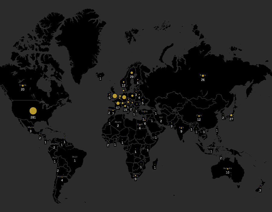
Created as a project for the course Data Visualization 101 from Parsons School of Design, this interactive map data visualization explores the disparities of Nobel Prize laureates by country of birth until 2021. By scrolling over the different countries, the user can find out more insights by country, including the number of awards per category and the differences between male and female laureates.

Language: English
Tool: Tableau Public
Tool: Tableau Public